Designing for Upsales
You're here! Hey everyone, they're here! We were hoping you'd visit. This page is meant to aid anyone building user interfaces for the Upsales brand. As you might notice, this page is a work in progress.
How we create a great product
Meeting our users needs are at the heart of the Upsales DNA and therefore at the centre of our design process.
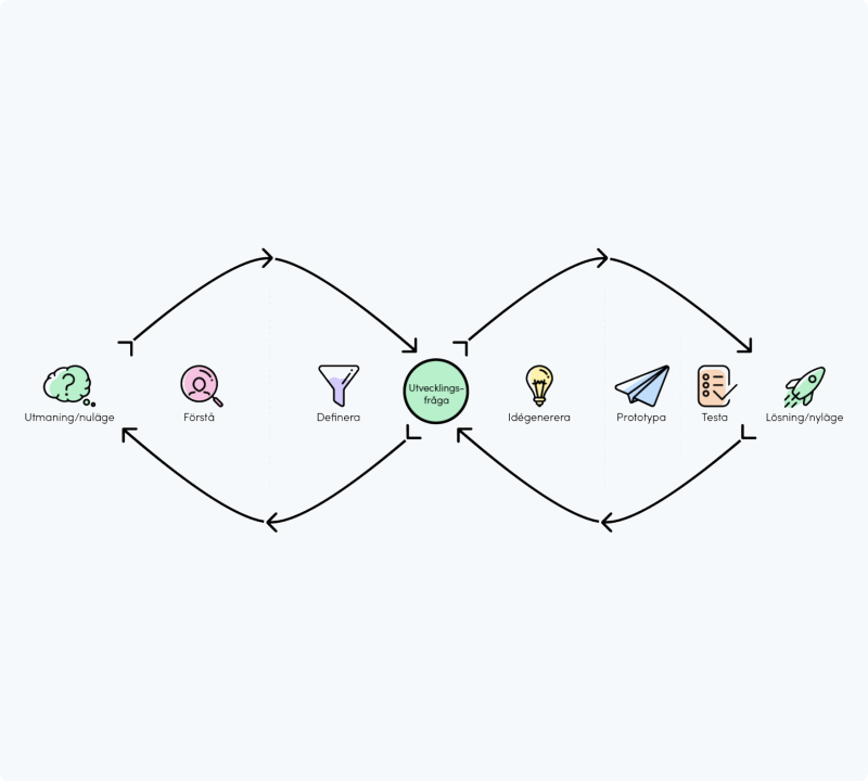
To make sure that we are developing a great product for our end users which focuses on the correct needs and behaviours, we work in an iterative manner through four stages. The stages combined make up the methodology of the Double Diamond Process.
The double diamond process
The Double Diamond Process consists of the four stages: Discover, Define, Develop and Deliver. Going through the different stages iteratively we are always making sure that the correct needs are understood and later met through our solutions.
Below is a compilation of how we approach all the different stages together with methodologies granting an effective design journey.
But before jumping into the rollercoaster that is the Double Diamond Process we must make sure that the hypothesis or problem area we are bringing into the design process is streamlined with the company vision, that is so we are focusing on areas that will make us strive forward towards the company goal.
Discover
Define
Develop
Deliver
The rule of 4
We try to base all of our pixel dimensions based on the number 4 (8,12,16,20, etc). This helps us keep consistency in things like paddings and margins across the different Upsales platforms.
4
8
12
16
20
Colour purposes
This section will help you decide when to use a certain color for your UI.
States
Our state colours are used to indicate things like restricted, warning, and success. Staying consistent with these guidelines creates a more intuitive user interface.
Danger
- An action is required from the user
- The system has failed to perform an action
- The user is about to perform an irreversible action (like deleting stuff)
- A date is overdue
Background color
$Super-light-red
Text color
$dark-Red
Icon color
$dark-Red
Alert
- An action is required from the user
Background color
$super-light-yellow
Text color
$black
Icon color
$black
Info
- No action is required from the user
- Use for tips or information that a user can benefit from
Background color
$Super-light-blue
Text color
$bright-blue
Icon color
$bright-blue
Success
- No action is required from the user
- An action was performed successfully
Background color
$Super-light-green
Text color
$green
Icon color
$green
Beta
- Release of a feature still in development
Background color
$Super-light-purple
Text color
$purple-dark
Icon color
$purple-dark
Looking for color swatches? We've gathered all of them on the brand page
Passive & disabled
This section is mainly based on our list rows and how we visualise their different states.
Passive
A thing you can click on which will probably lead you somewhere.
I'm the main title of this thing
I'm the subtitle of this thing
Main title color
$Black
subtitle color
$grey-11
BG color
$white
BG color:hover
$grey-1
Box shadow
Optional
Disabled
A thing usually clickable, but for some reason is currently restricted e.g disabled.
I'm the main title of this thing
I'm the subtitle of this thing
Main title color
$grey-10
+ italic
+ Normal weight
+ italic
+ Normal weight
subtitle color
$grey-10
italic
+ Normal weight
italic
+ Normal weight
BG color
$grey-1
BG color:HOVER
no change
Box shadow
None
Icon usage
Icons are used to speed up the UI in the sense that a user will find what they are looking for faster with an icon. Also, well-designed icon helps to explain the UI.
Icon states
Interactive Icons, two different state alternatives showing if an icon is active or not.
Specific active state behaviour
General active state behaviour
Icon aligment
This guide is aimed at maintaining the readability and speed of finding things in Upsales lists. If the icon is placed on the right side of the text the icon position will vary depending on the text length. Having the icon change positions instead of the text is preferred since it still maintains a good readability.
If all the columns have icons:
✔ Place icon to the left of the text
If all the columns doesn't have icons:
✔ Place icon to the right of the text
Always accompany an icon with explanatory text
If a text isn't placed beside the icon to explain it then showing the text in a tooltip is a preferred usage.
Button hierarchy
We try to minimize the colors of the UI to make the ones we do use pop more. This is why most of Upsales tends to use white or shades of grey to make the actions and important things really visible.
We try to minimize the colors of the UI to make the ones we do use pop more. This is why most of Upsales tends to use white or shades of grey to make the actions and important things really visible.
Primary
primary button
Solid style
Solid style
Default
default button
solid style
solid style
Tertiary
Tertiary button
Link style
Link style
Danger
Danger button
solid style
solid style
Primary
Primary button
Solid style
Solid style
Default
Default button
Solid style
Solid style
Tertiary
Tertiary button
link style
link style
Danger
danger button
solid style
solid style

✗ Try to only have one primary button visible at once.

✔ If multiple actions have the same importance switch all to default button.
.png)
✔ Have multiple main action alternatives on a state color background? Switch button type to outline.
Typography guides
The branding page shows you measurements and font specs. This section will help you decide the to use a specific style or size.
Looking for font styles, sizes and weights? Check out the branding page.
Base font size
We are working on our way up to establishing 16px as our base font size. But until then, base your UI on font-size 14px (Text Medium) and work your way up from that.
It's OK to use font size 12, just remember 14 is your base.
It's OK to use font size 12, just remember 14 is your base.
Headline vs Title
The headline is the big bold message while the title stays a bit more subtle. Our rule of thumb is to only use one headline per page. Following this principle will give your page a clear hierarchy.
Headline = Only once
Title = Add mutiple
Headline = Only once
Title = Add mutiple
Spacing
Spacing elements also uses the rule of 4 mentioned above. Our most common spacing values are 8px, 16px and 20px. Please see the examples below.
8px
16px
20px
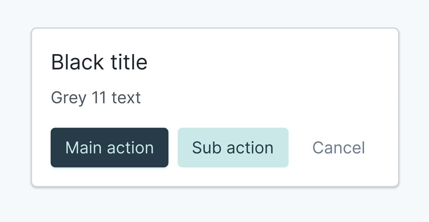
Basic card construction
Cards are a common element in the Upsales UI design. The construction is a rough sketch of our cards are constructed.
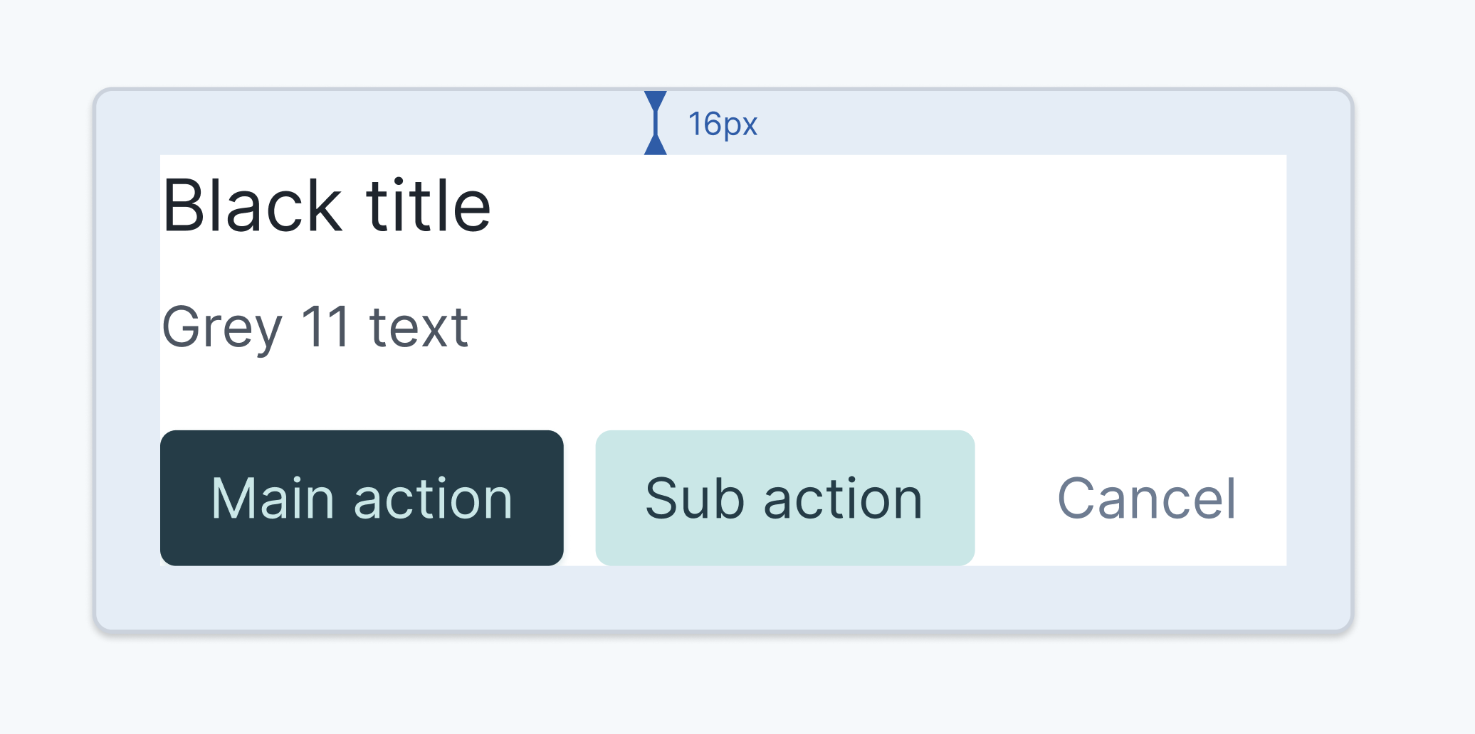
Card padding
✔ base card padding: 16px
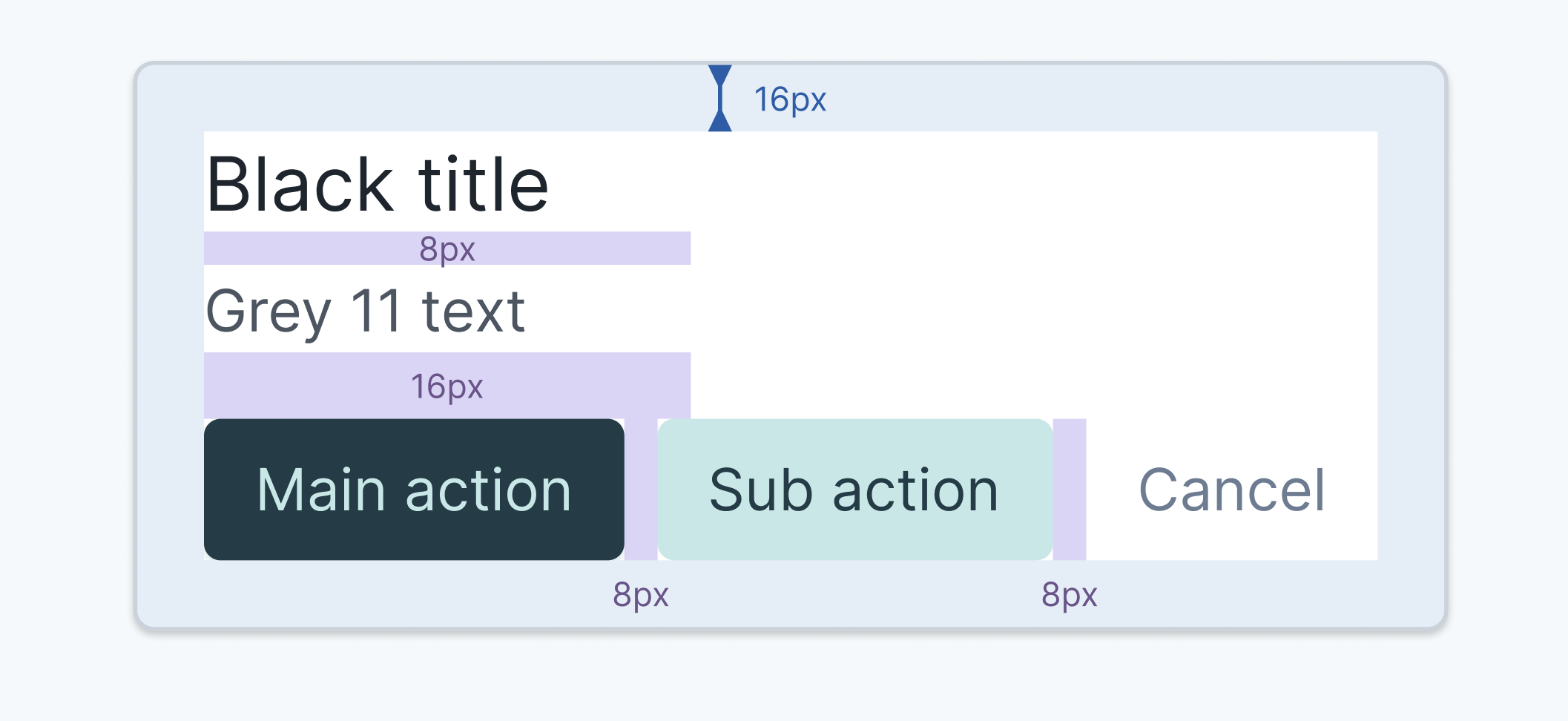
Content spacing
✔ text spacing: 8px
✔ element type spacing: 16px
✔ button spacing: 8px
✔ element type spacing: 16px
✔ button spacing: 8px
Card Specs
✔ Border radius: 4px
✔ background color: $white
✔ Border: 1px solid $grey-6
✔ Title MD: $black
✔ Text MD: $grey-11
✔ background color: $white
✔ Border: 1px solid $grey-6
✔ Title MD: $black
✔ Text MD: $grey-11
Button spacing
Be cool, stay consistent.
Small button spacing: 8px
Medium button spacing: 8px
Large button spacing: 12px
Background
Rule of thumb is that we are using #White background for the most primary content/ information on the page, content that requires the most attention. This is to make the content more prominent for the end users.
The secondary content/information will use a #Grey-1 background. Examples of secondary contents are; Metadata and menus.
The secondary content/information will use a #Grey-1 background. Examples of secondary contents are; Metadata and menus.
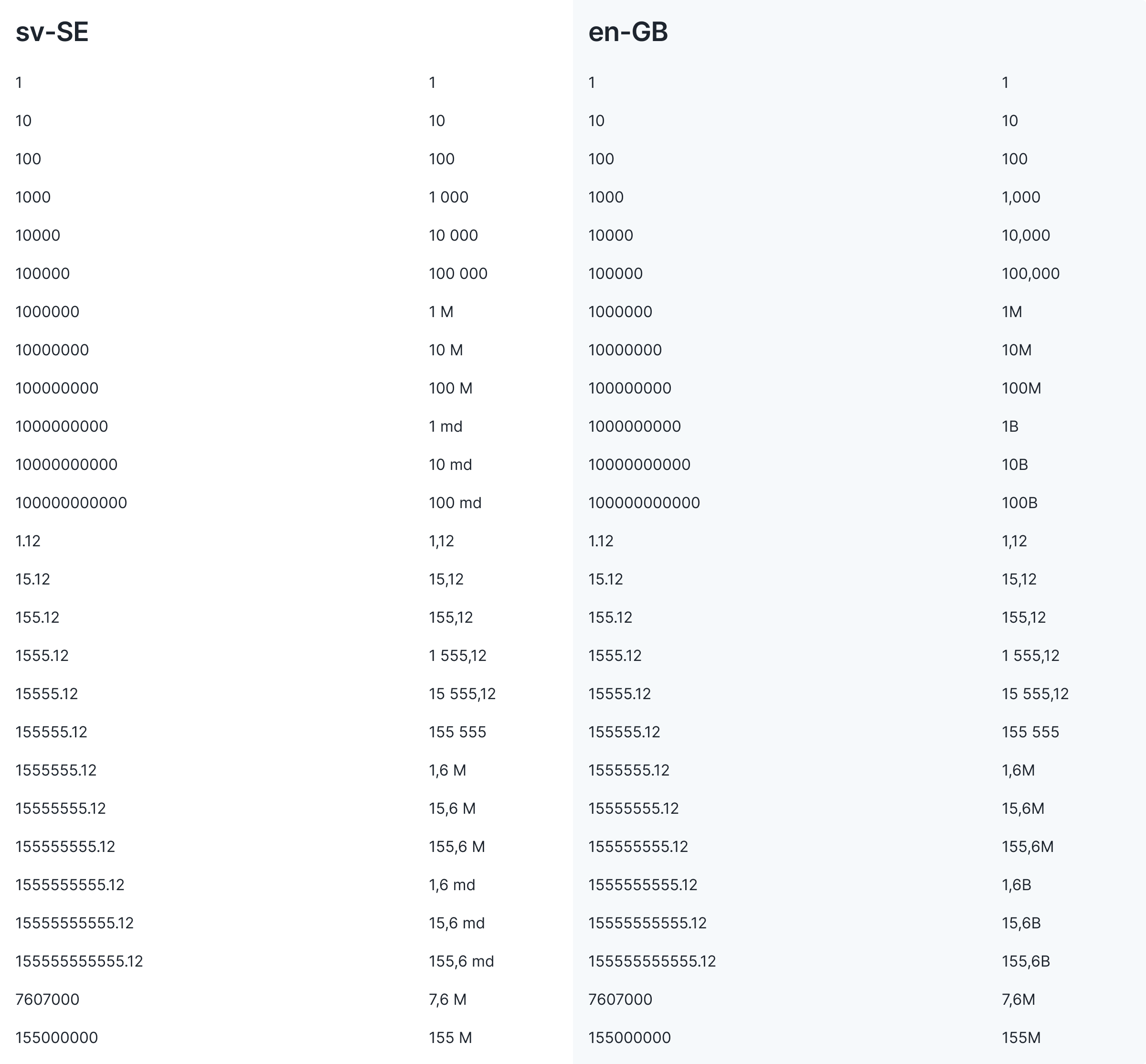
Value formatting
Following formatting is being used to make sure that the product is concise in how value/sum is presented.
Components
Upsales is made up of many recurring components. When designing, it is important the components are being used correctly. This to make sure the product is consistent and always satisfies the users expected behavior, resulting in a reduced cognitive load for our users when interacting with the interface.
Modal vs drawer
.png)
.png)
Drawer / Slideout-panel
The drawer allows for more content/information or additional interactions related to the user's primary flow.
The drawer always maintains contextual connection to the primary flow/task the user gets through/wants to accomplish.
The drawer always maintains contextual connection to the primary flow/task the user gets through/wants to accomplish.
Modals (full page)
Modals are used for isolated flows/actions, independent processes (tasks that have a clear start and end point).
Modals interrupt users and require an action.
They are suitable when the user's attention needs to be directed to important information.
Modals interrupt users and require an action.
They are suitable when the user's attention needs to be directed to important information.
Pop-up / confirmation dialog
We use pop-ups/confirmation dialogs for actions that require extra focus from the user, such as: Delete, leave without saving, etc.
Lists
.png)
.png)
List with side-menu
Preferred list layout when the users intended goal is to take quick actions or process (check off) the list-cells.
Pros:
- All list-views are visible directly in the interface
- Easy/fast to switch between list-views
Cons:
- Takes up a lot of the viewport width
- less information visible in the list
- (Time of writing) There is no specific UX/UI for saving list-views
Full width list (no side-menu)
Preferred list layout when the users intended goal is to review and interpret information/insights. Compare list-cells and rows.
Pros:
- Saved list-views do not take up space from the list content
- More information visible in the list
- Saved list-views can be accessed from the main navigation (appbar)
Cons:
- Difficult to find/understand how to save a list-view and locate saved list-views