Brand guidelines
Logo
Download logos & logo pack
Overview
Clearspace
Product icon
It can also be used when space is limited, and the primary logo appears too small. A good rule of thumb is: for applications where the image shown will be smaller than 100px, use the product icon.
Usage
Guide
Download logos & logo pack
Colours
Overview
Primary colours
Money green is our main action color in our products and is the main color of the brand.
Money green light is our secondary action color and is also used for our success state.
Black is our headline colour
Grey 11 is for body text
Grey 1-3 can be used for neutral backgrounds
White is our main background colour.
Secondary Colours
Specialty Colours
Greys
Colour guidance


Typography
Overview
Inter Semi-bold 600
Inter Regular 400
Roboto Mono Regular 400
Typography guidelines
This headline is 2 times larger than the subheadline
This subheadline is 1.5 times larger than the body text
This is a standard body text. Lorem ipsum dolor sit amet, consectetur adipiscing elit, sed do eiusmod tempor incididunt ut labore et dolore magna aliqua. Ut enim ad minim veniam, quis nostrud exercitation ullamco laboris nisi ut aliquip ex ea commodo consequat. Duis aute irure dolor in reprehenderit in voluptate velit esse cillum dolore eu fugiat nulla pariatur. Excepteur sint occaecat cupidatat non proident, sunt in culpa qui officia deserunt mollit anim id est laborum.
Inter Semibold
2 times larger than subheadline
Leading = Same as text size
Tracking = o
Inter semibold
1.5 times larger than body text
Leading = 1.33 times the text size
Tracking = 0
Inter regular
Leading = 1.5 time the text size
Tracking = 0
Styleguide web
To ensure a cohesive experience with good readability, use this type scale as a guide when setting texts for the web.
Headline: Desktop
scale
weight
size
line-height
XXL
Semi-bold 600
80px
-
XL
Semi-bold 600
68px
-
Large
Semi-bold 600
58px
-
Medium
Semi-bold 600
38px
-
Small
Semi-bold 600
28px
-
Extra small
Semi-bold 600
16px
Title: Desktop
scale
weight
size
line-height
Extra large
Regular 400
24px
-
Large
Regular 400
22px
-
Medium
Regular 400
18px
-
Small
Regular 400
14px
-
Extra small
Regular 400
12px
-
Text: Desktop
scale
weight
size
line-height
Extra large
Regular 400
24px
-
Large
Regular 400
22px
-
Medium
Regular 400
14px
-
Small
Regular 400
12px
-
Examples
The intelligent
CRM for fast-growing companies
Built to close deals and uncover opportunities
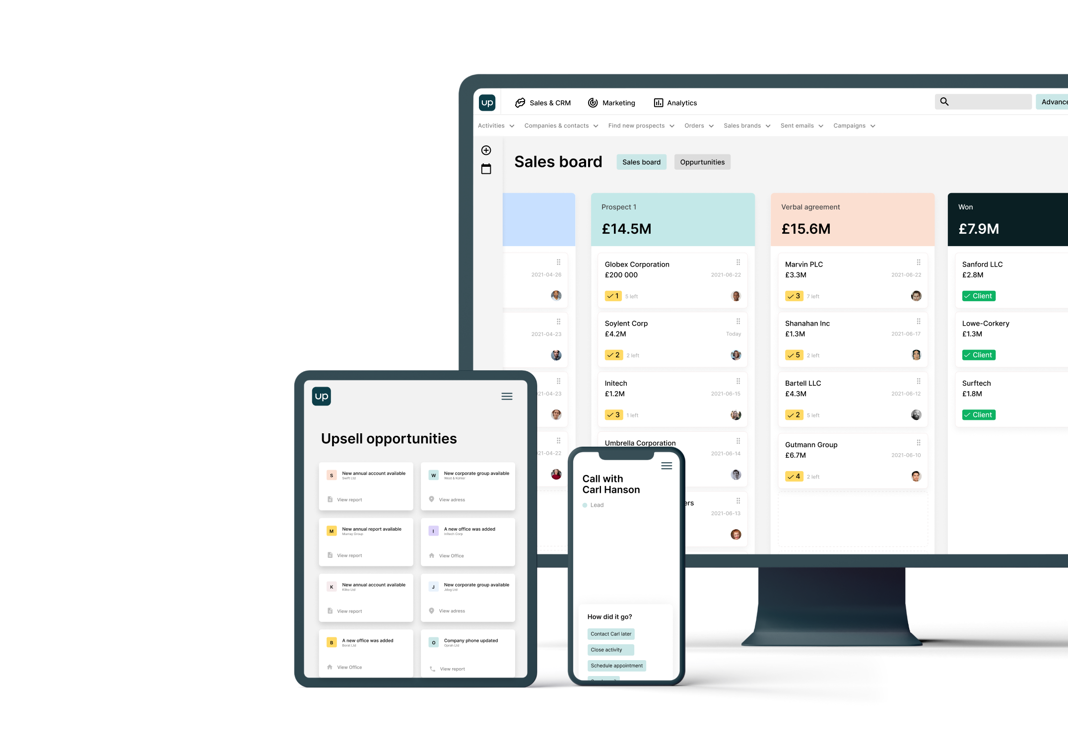
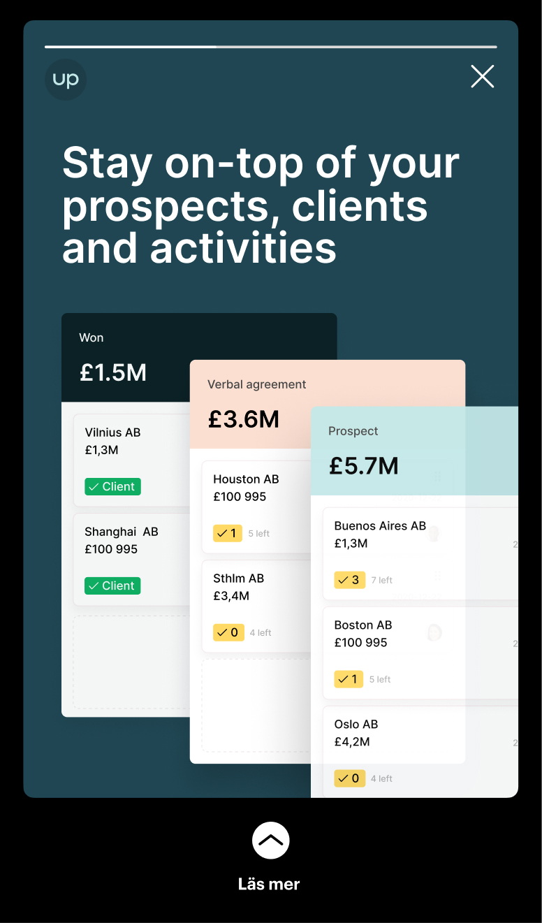
Stay on-top of your prospects, clients and activities
Easily see how many meetings and opportunities are needed to reach your sales goals, and make your plans based on facts. Upsales optimises your prospecting and enables you to find quality leads - often where you didn’t realise there were any.
Stay on-top of your prospects, clients and activities
2021.03.02
Easily see how many meetings and opportunities are needed to reach your sales goals, and make your plans based on facts. Upsales optimises your prospecting and enables you to find quality leads - often where you didn’t realise there were any.
Easily see how many meetings and opportunities are needed to reach your sales goals, and make your plans based on facts. Upsales optimises your prospecting and enables you to find quality leads - often where you didn’t realise there were any.
Daniel Wikberg, Founder & CEO
Icons
Icon library
Sales entities & features
Marketing entities & features
Phones & phone calls
Appointments
Navigation
People
Communication
Social media & partners
Status
Actions
Charts & graphs
Lists
Currency
Editor elements
Time
Files
Various
Download/install
In Figma, Sketch etc:
1. Download the latest version below
2. Install on your computer
3. Copy icons above and paste into your document
4. Switch font to Upsales
In code:
1. Download the latest version below
2. Add font to your repository
3. To render icons, use the prefix Icon Icon-*: <i class="Icon Icon-check"></i>
Visuals
Overview


Guide
Download
.svg)
Overview
Download
Photography
People


Objects


Spaces


Outdoor advertising


Online advertising


Download
Overview


Download
Presentations
Overview


Download
Overview


Social Media
Overview
Download